Did you know that usability determines the success of the website, rather than its actual utility? So let us explore the key principles that lead to the design of an effective, user pleasing website.
Begin by trying to understand how your website visitors think. Have you ever watched people visiting a grocery store? They walk down the aisles looking for a specific product, or maybe just trying to figure out if there’s something of interest for them in that particular store. Sometimes they will stop and look at a product label, or maybe even pick up the product and examine it carefully.

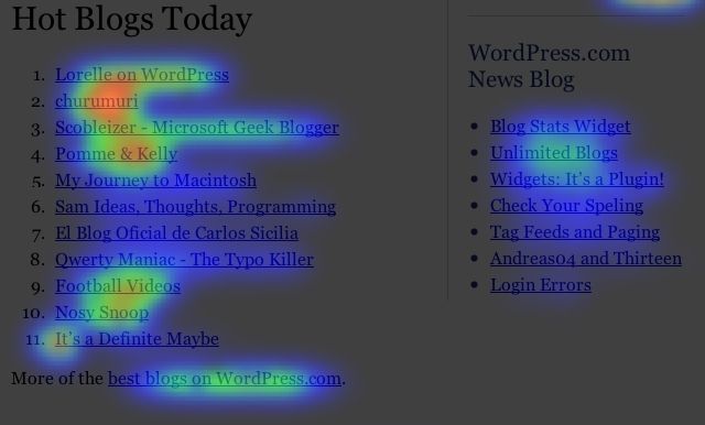
People who visit your website go through a similar process: they will scan your website pages, rather than taking the time to read the entire content. These days, people are unable to focus their attention on a particular page for more than a few dozens of seconds (at most) but this limitation can actually be used as an advantage for us.
So how do you do that? Be sure to create content that screams quality each phrase. If your website pages provide high quality content, your visitors will be practically forced to read it. I am sure that you have visited websites that had poor designs, and yet high-quality content. People continue to visit these types of sites not because they use modern web technologies, but because their content makes the visitors ignore the design.
Great content will not always satisfy an impatient website visitor, though. Some of these people will still expect to receive instant gratification, so be sure to cater for their needs as well. Provide nuggets of ultra high quality information and highlight them every few paragraphs, allowing these users to get a lot of value by simply scanning your website page.
You should also be aware of the fact that most users won’t follow the desired website navigation path. Sure, you have built your website logically, but don’t expect your logic to always match your website visitors’ logic. Often times, they will choose one of the website menu options that appears to be the right one, leading to the page that they are interested in. But if that link doesn’t lead to a page that provides the desired content, they will think that your website is not the best information source for the topic that interests them. And a simple click on their browsers’ “Back” button will send them back to Google search results list.
This is why services like Crazy Egg have become so popular lately. Basically, they allow you to spy your website visitors’ behavior, and then optimize the site, with the goal of making it acceptable for as many people as possible.
Don’t forget that users want to feel in control, though. Don’t throw pop-ups at them, especially when those pop-ups would break their reading experience. Also, don’t give the users lots of different options. Whenever it’s possible, limit their choices to a minimum. Keep your website simple and self-explanatory.
If your website provides a specific service, make it as easy as possible for people to try it out, while still being able to capture the needed lead generation info. Would you rather have full contact info for five people, or names and e-mail addresses for 100 people? Don’t make your website visitors fill long website forms. It is much better to allow them to discover the great features of your service without filling in any form, and then attract them to your paid, much better version of the service.
If it looks like we are fully embracing the “keep it simple” principle, that’s 100% true, at least when it comes to web design. If your website is responsive and looks decent, its success will be determined by the quality of its content most of the time. Keep the ads to a minimum and provide what people expect from you: a great user experience. Do this and people will visit your website, fill in your forms and use your services. It’s a promise!